CREATIVE DIRECTOR
apricotlaw rebrand
the rebrand
Time for a serious upgrade
01. Why Redesign
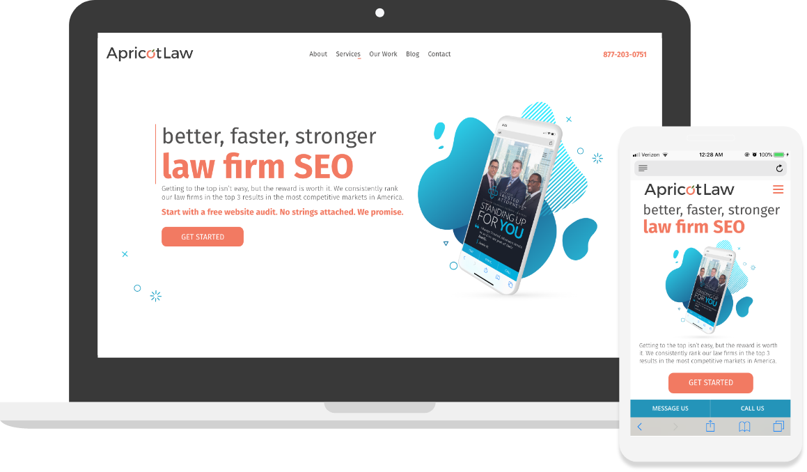
The original ApricotLaw branding had become quite dated. The logo was made using clipart, the color scheme was jarring and the imagery and style of the website wasn’t up to the standards we maintained for our client’s websites. In order to showcase ourselves properly, we needed a site that represented what we could really create.
02. The DEtails
We wiped the slate clean and started off with a brand new logo featuring a modern apricot illustration as the “o” in ApricotLaw. The color scheme was inspired by our namesake color, complimented by a bold blue. Our previous branding was busy with a tech feel to it and utilized a lot of stock photography. In our new design we opted for more whitespace, minimalist font choices, subtle animations and approachable illustrations.
03. The Collaboration
This project required leadership across cross-functional teams. I lead design, content, social media and development teams on conceptualization and strategy to improve the messaging, branding and performance. I also lead the design and content teams to implement the “Story Brand” framework in our design and content strategy to clarify our company’s message.
03. The Development
The focus for the development team on this project was to build a lean, lightning fast site that provides a great experience on both desktop and mobile. We minimized all excess css and scripts to deliver a great experience for potential clients that land on our site.